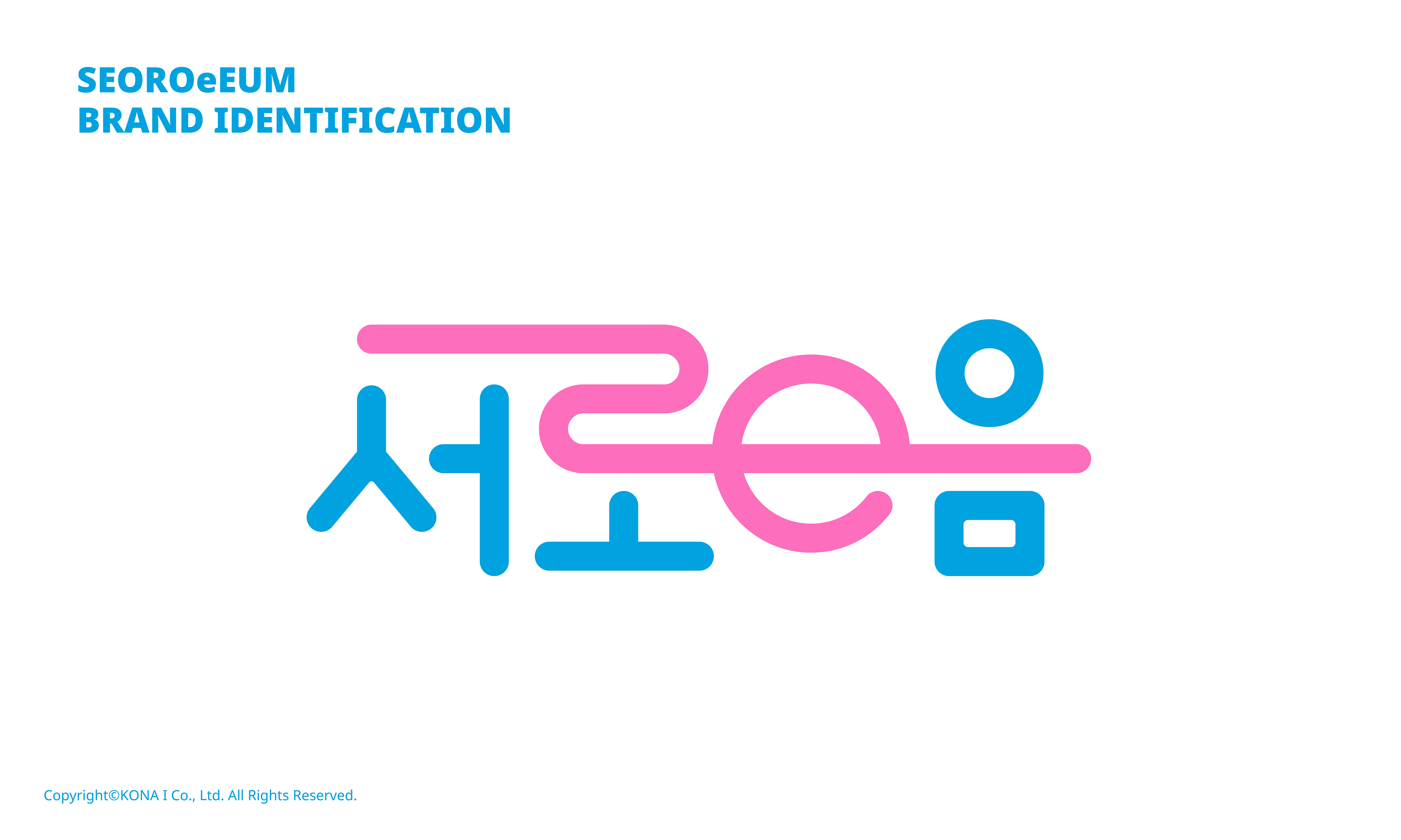
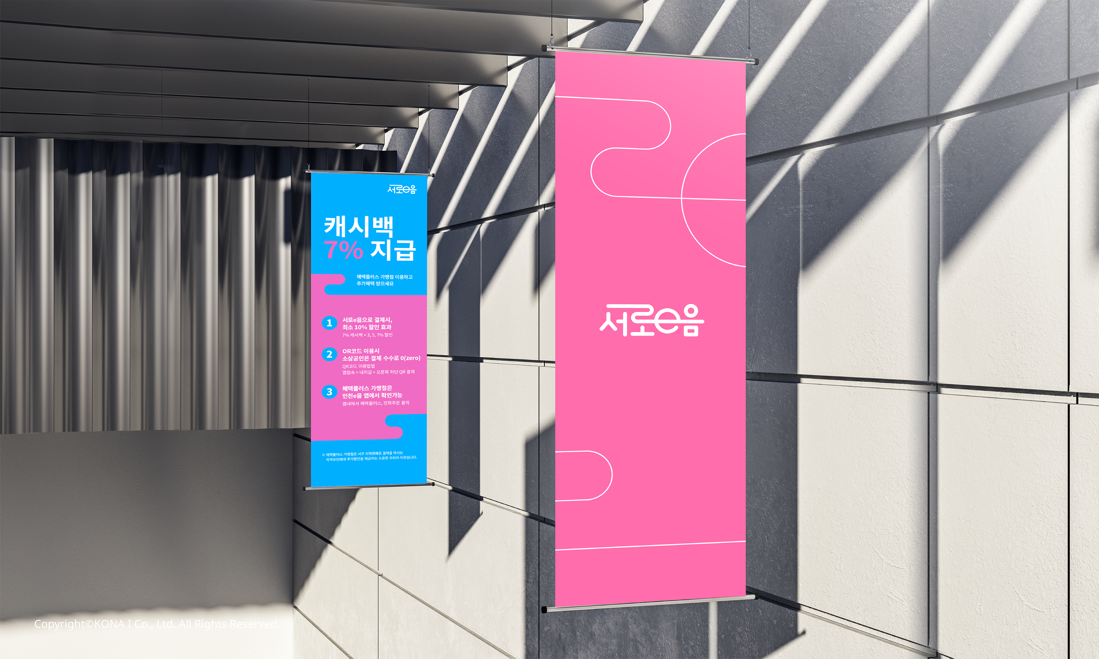
‘서로e음’ BI는 인천 서구 지역 경제 활성화를 위한 지역화폐로 한국적인 ‘한글’, 인천지역 특징 ’바다’, ‘길’을 표현한 ‘곡선’ 등을 요소로 활용하여
‘소통’으로 의미를 담아 지역민(소비자)과 소상공인(생산자)에게 전달 될 수 있도록 디자인 되었다.
‘소통’으로 의미를 담아 지역민(소비자)과 소상공인(생산자)에게 전달 될 수 있도록 디자인 되었다.
‘서로e음’ BI는 디자인 선정 방식에 있어서도 ‘소통’을 담은 디자인을 하기위해 지역민과 소상공인에게 여러 디자인을 제안하고 투표하여 선정하게 하였다.
이렇게 지역민과 함께 만들고 관리하는 지역의 BI가 만들어졌고, 사용되고 있다.
이렇게 지역민과 함께 만들고 관리하는 지역의 BI가 만들어졌고, 사용되고 있다.
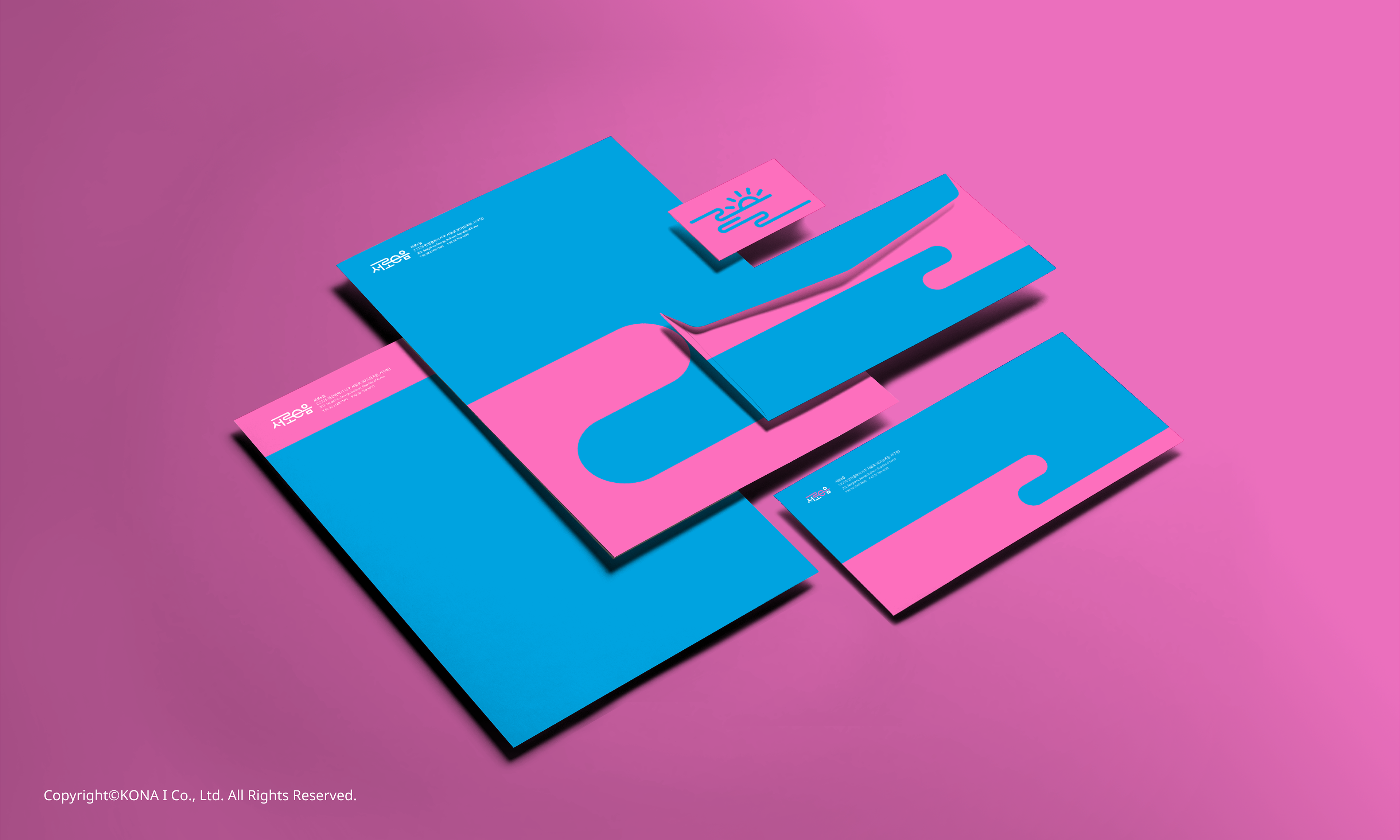
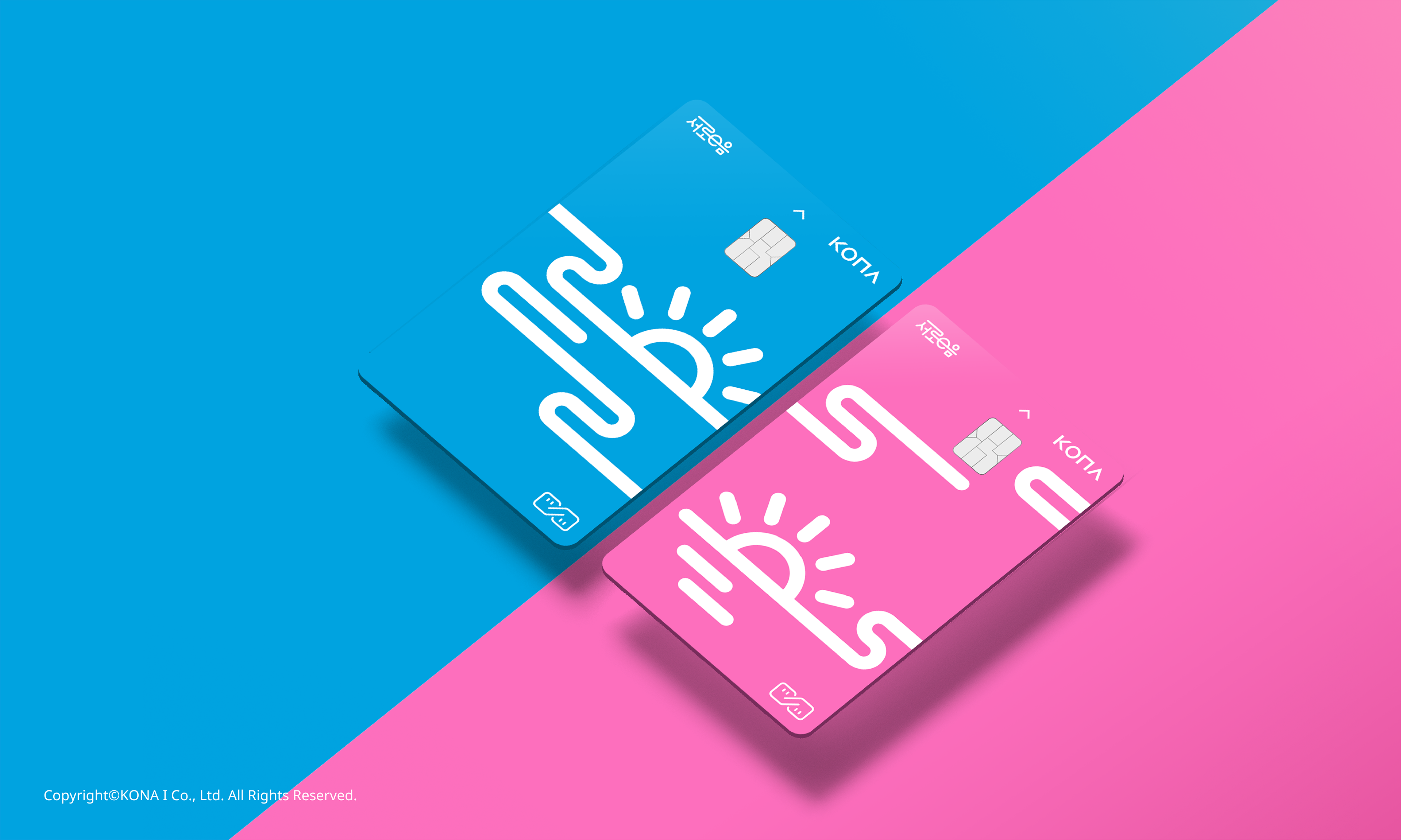
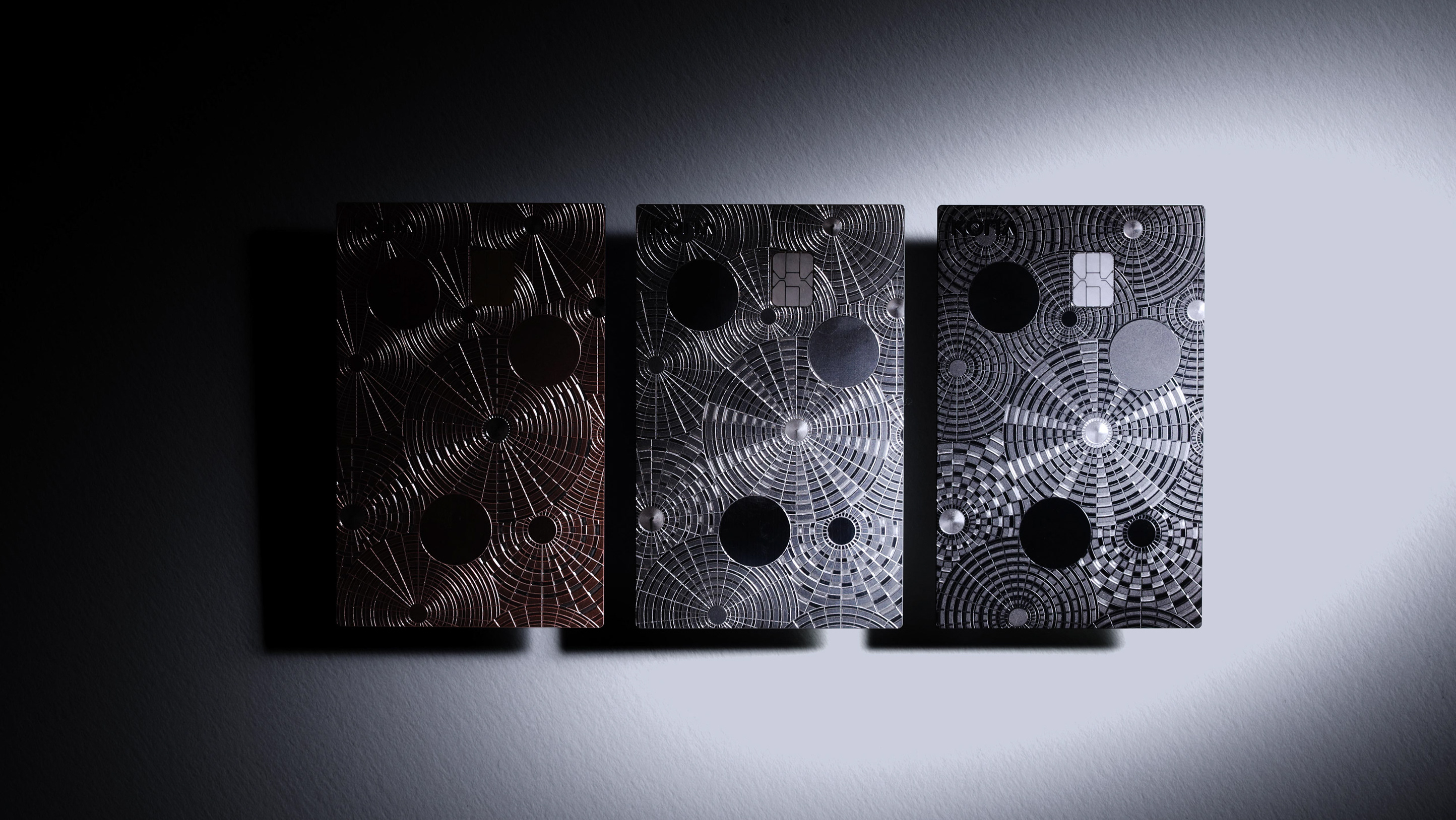
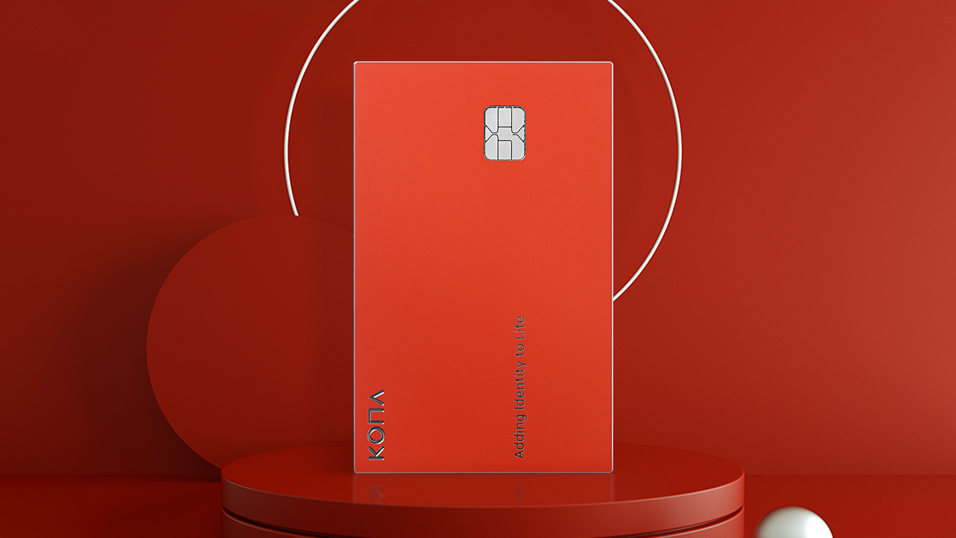
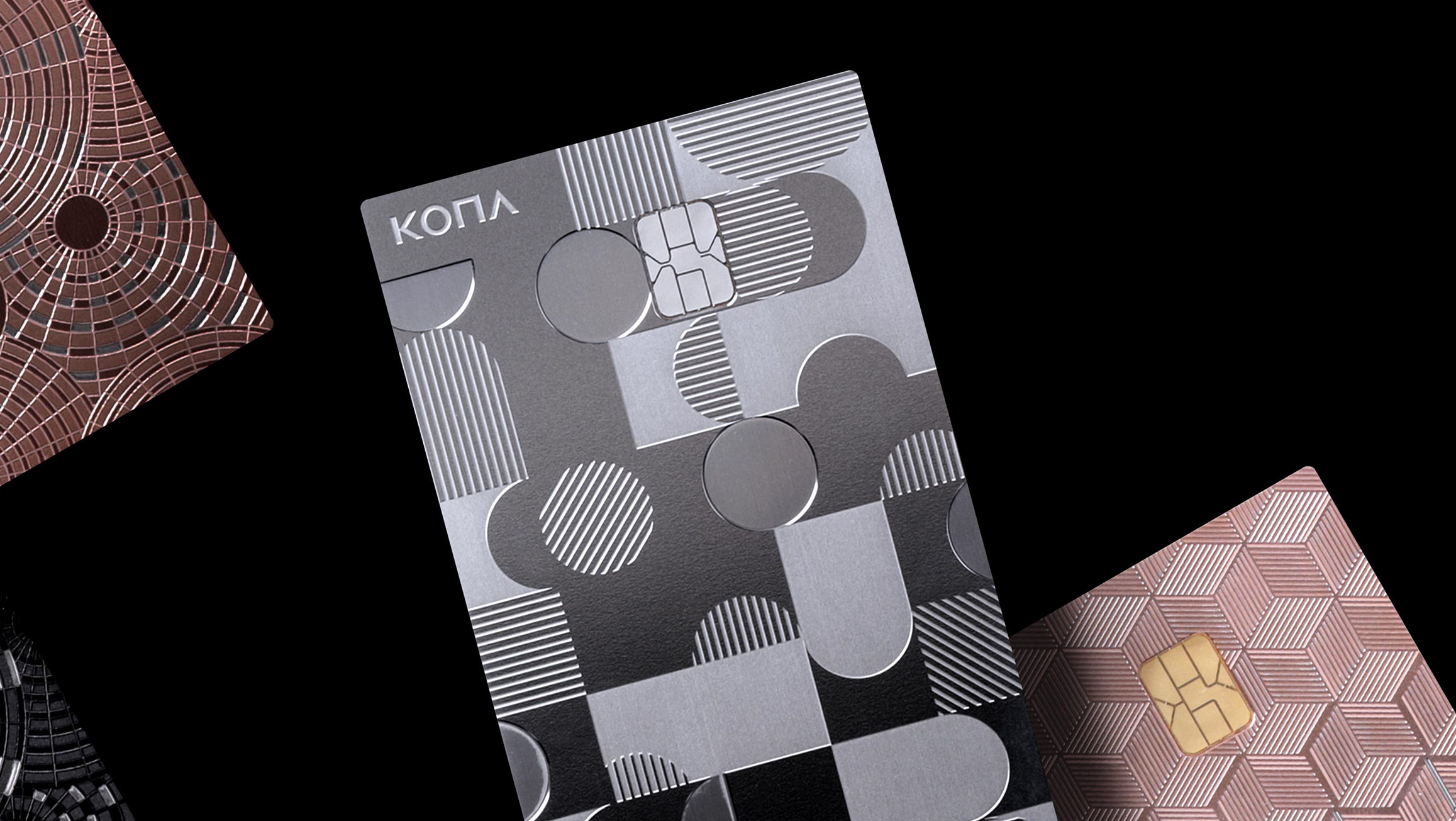
‘서로e음’은 BI 디자인은 다양한 지역혜택을 제공하며 앱과 연동된 결제카드 그리고 여러 매체 광고물을 통해 배포 된다.
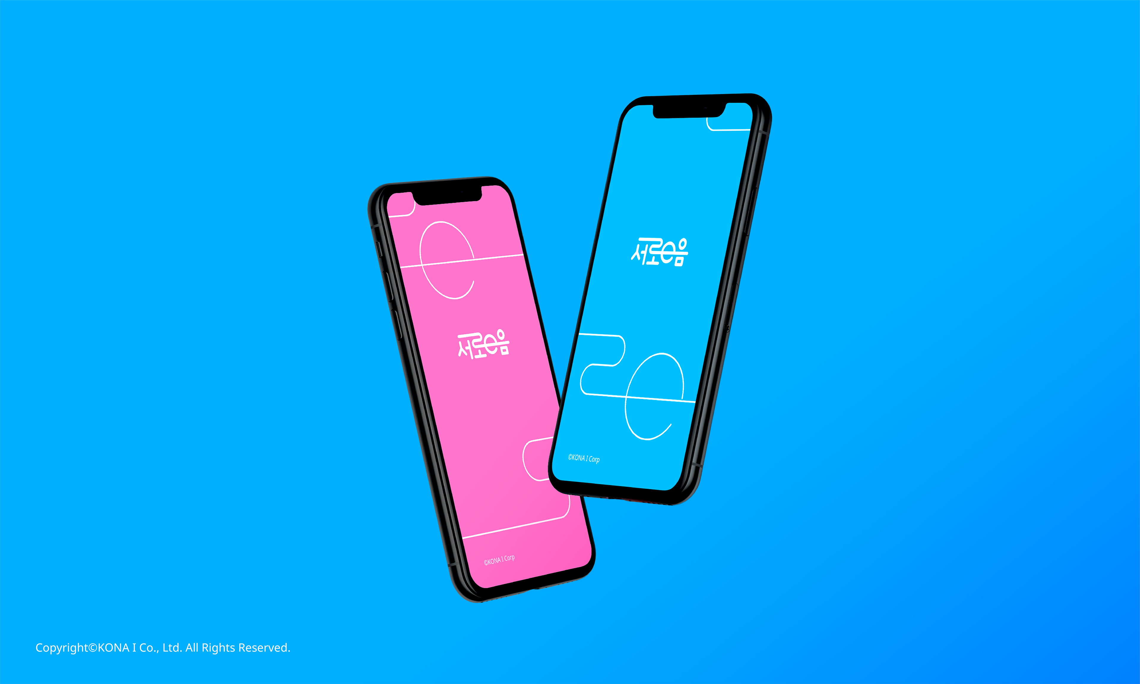
그렇기 때문에 어떤 채널에서든 동일한 브랜드를 경험할 수 있도록 시각적인 아이덴티티를 유지하며 넓게 확장될 수 있도록
직선(소통)과 곡선(인천의길) 등의 그래픽 요소들을 활용하여 ‘서로e음’의 디자인 시스템 견고하게 개발 하였다.
그렇기 때문에 어떤 채널에서든 동일한 브랜드를 경험할 수 있도록 시각적인 아이덴티티를 유지하며 넓게 확장될 수 있도록
직선(소통)과 곡선(인천의길) 등의 그래픽 요소들을 활용하여 ‘서로e음’의 디자인 시스템 견고하게 개발 하였다.
'Seoro e-eum' Business Identity is a local currency for revitalizing the economy in the western region of Incheon,
and uses the Korean 'Hangul', the characteristic 'sea' of the Incheon area,
and the 'curve' that expresses the 'road' as elements to express the meaning as 'communication'.
It is designed to be delivered to local residents (consumers) and small business owners (producers).
and uses the Korean 'Hangul', the characteristic 'sea' of the Incheon area,
and the 'curve' that expresses the 'road' as elements to express the meaning as 'communication'.
It is designed to be delivered to local residents (consumers) and small business owners (producers).
In the “Seoro e-eum” BI, in order to create a design that includes “communication” in the design selection method,
local residents and small business owners were asked to vote for various designs
so that the users can take part in nominating the design of the card.
local residents and small business owners were asked to vote for various designs
so that the users can take part in nominating the design of the card.
The BI design of 'Seoro e-eum' provides various regional benefits, and is distributed through payment cards linked to apps
and advertisements in various media.
and advertisements in various media.
Therefore, the design system of 'Seoro e-eum' is developed robustly by utilizing visual elements
such as straight lines (communication) and curves (Incheon Road) so that the visual identity can be maintained everywhere.
such as straight lines (communication) and curves (Incheon Road) so that the visual identity can be maintained everywhere.